AI Thumbnail Maker: High-CTR Covers Built for Every Feed
2026-08-28
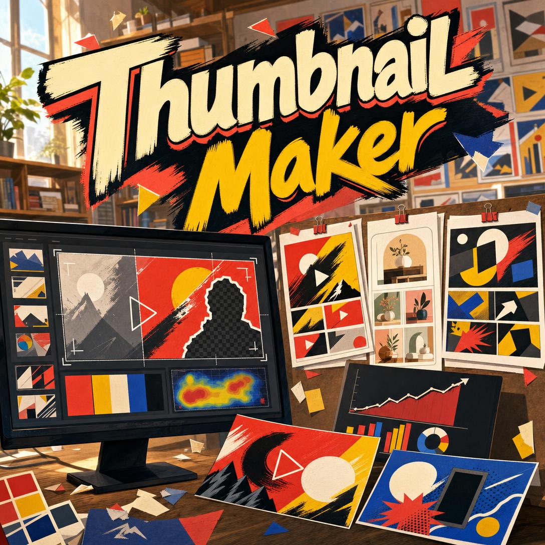
Thumbnail Maker helps you win the click by designing platform-native covers around attention psychology, not decoration. While most videos are judged in a fraction of a second on a crowded home feed, this AI builds the visual half of a thumbnail-and-title system so curiosity, emotion, and value are obvious at tiny scale.
✅ Engineered for YouTube, Xiaohongshu, Bilibili, Instagram, TikTok, and Pinterest — not a one-size canvas ✅ Composition, color, and type chosen so the image still reads in a sidebar-sized crop ✅ Opinionated defaults: it pushes back when a layout would vanish in the feed ✅ Built-in A/B thinking — one variable at a time, so tests actually teach you something
YouTube itself notes that viewers usually see the thumbnail and title first, and that pairing is what decides the click. To understand why so many custom covers still underperform, it helps to look at how feeds, CTR math, and visual attention actually work.
Quick Answer: What Is Thumbnail Maker?
Thumbnail Maker is an AI thumbnail designer that builds platform-native covers using click psychology so creators earn more views from the same impressions. It treats the image as a click trigger, not clip art.
Key capabilities:
- YouTube, Xiaohongshu, Bilibili, Instagram, TikTok, Pinterest, and podcast-cover formats with the right aspect ratio
- Click-system design: the image carries what the title cannot say
- Face-plus-text, before/after, numbered cards, product heroes, and other high-CTR composition patterns
- Fast iteration with single-variable A/B variants for Test & Compare workflows
Why Most Thumbnails Disappear in the Feed
A thumbnail is not a poster. On YouTube it is often judged at roughly sidebar size, then again on mobile home. YouTube’s own creator guidance is blunt: 90% of the best-performing videos use custom thumbnails, and the image has to work with the title as a single story — not a second copy of the same sentence.
CTR is the diagnostic. vidIQ reports that a strong thumbnail CTR often lands around 5–7%, while many channels average closer to 3–4%. Broader compilations put half of all channels between 2% and 10%, with browse/home traffic naturally lower than search. A two-point CTR gap does not sound dramatic until the algorithm compounds impressions.
90% — Share of top-performing YouTube videos that use custom thumbnails
5–7% vs 3–4% — Strong YouTube thumbnail CTR versus typical channel averages
Visual science backs the obsession with faces, contrast, and a single focal point. An NIH eye-tracking study on social feeds found that human presence and marketing cues pulled the longest fixations, consistent with classic findings that faces capture attention faster than objects. Pair that with memory research showing people retain about 65% of information three days later when a relevant image is attached to the message, and the job of a cover becomes obvious: stop the eye, then make one promise.
But designing that promise is frustratingly difficult:
- It has to read at postage-stamp scale. Fine detail, thin type, and busy collages vanish. Loomly’s thumbnail guidance puts this first: the idea must be understandable when small.
- Title and image often say the same thing. Duplicate text wastes half the click system. The thumbnail should show what the title cannot; the title should frame why it matters.
- Templates look like everyone else’s row. High saturation without a hook still blends into YouTube’s white or dark feed.
- Platforms do not share a visual language. A YouTube face-reaction cover can fail on Xiaohongshu, where magazine-style 干货 cards and numbered lists are the native click bait.
- Clicks without watch time backfire. YouTube uses CTR alongside average view duration. High CTR with a fast bounce reads as clickbait and starves future impressions.
This is the gap a click-first designer is built to close.
How It Works
You do not start in a blank artboard. You describe the video, the platform, and the hook. This thumbnail designer infers format (YouTube 16:9 by default, Xiaohongshu 3:4 when the brief is a 笔记 or 封面), picks a composition pattern, and generates a cover meant to work at feed scale.
Step 1: Name the Content, Platform, and Click Trigger Say what the video teaches, who it is for, and whether you want curiosity, a value promise, or an emotional reaction. If you skip the platform, YouTube 16:9 is the default; mention 小红书, B站, a pin, or a Reel and the ratio changes.
"YouTube thumbnail for a 12-minute video: I rebuilt a $40 thrift-store lamp. Curiosity hook, warm workshop light, text: $40 LAMP. Don’t repeat the title on the image."
Step 2: Generate With Feed-Scale Defaults The first pass locks one focal point, 2–3 elements, and type that can survive a phone-sized home feed. YouTube recommends 1280×720 at 16:9 (under 2MB, JPG/PNG/GIF) — and the design still has to hold up far smaller than that. Important content stays in the upper portion of the frame so duration badges do not cover the hook.
"Face on the right third, shocked expression looking at the lamp, navy background, yellow headline, leave the bottom-right clear for the timestamp."
Step 3: Drop in a Real Photo When You Have One Upload a headshot, product still, or screenshot and it gets placed as the hero — not pasted on like a sticker. If the face needs retouching first (lighting, skin, background cleanup), Photo Editor can prep a clean still so the thumbnail expression stays readable at small size.
"Use this selfie on the left third. Keep the expression, lift contrast, put BEFORE / AFTER on the opposing panels."
Step 4: Iterate One Variable, Then Adapt the Format After the primary cover, ask for a single-axis variant: expression, background color, hook angle, or text phrasing. That is how YouTube’s Test & Compare stays readable. Need the same video on Xiaohongshu and Pinterest? Adapt ratio, text density, and platform conventions without throwing away the palette.
"Same layout, swap the hook from curiosity to value promise. Change text to 3 STEPS. Keep face, lamp, and navy/yellow."
Try Thumbnail Maker free — no credit card required.
Creative Showcase
🎬 Tutorial Thumbnails That Sell the Finished Result
Scenario: A cooking channel uploads “How I Make Weeknight Ramen in 15 Minutes.” The title is searchable. The cover has to tease the bowl, not the prep mess.
Traditional Approach: A dim stovetop photo, eight words of overlapping type, and a watermark. It may look “on brand” in Photoshop and still die next to brighter suggested videos. TubeBuddy’s creator roundup keeps coming back to punchy, short text — numbers especially.
Thumbnail Maker: A finished-bowl hero, steam and warm light, 3–5 words max (“15-MIN RAMEN”), one clear focal point. The title carries the how-to; the image carries appetite.
- Outcome-first instead of process-first
- High value contrast against both light and dark YouTube chrome
- Room left for the duration badge
📱 Xiaohongshu Covers Designed From Your Phone
Scenario: You are on the subway with a skincare routine photo and need a 3:4 干货 cover before the 笔记 goes live. There is no desktop, no type hierarchy, and the Xiaohongshu feed punishes cluttered Western YouTube layouts.
Traditional Approach: Stretch a 16:9 YouTube export, cram a paragraph of Chinese onto the image, and hope. Text that worked on a monitor becomes unreadable in a two-column mobile grid.
This designer: Magazine-style 3:4 card, numbered steps (“5步搞定”), clean hierarchy, decorative but not noisy. You can brief it from iOS or Android with the same results as desktop — posts with strong visuals consistently earn more engagement than text-only notes, and Xiaohongshu viewers expect the cover to signal organized value.
- Native 1080×1440 thinking, not a cropped YouTube still
- Text-heavier layouts that still hold at grid size
- Full feature parity on web, iPhone, and Android
If you also need the caption, hooks, and hashtags that sit under that cover, Social Media Content Generator can draft platform-native copy so the title and thumbnail stay complementary instead of redundant.
🎯 Review Thumbnails With a Verdict, Not a Catalog Shot
Scenario: A tech creator is comparing two budget laptops. A flat product photo does not tell the browse viewer why they should care.
Traditional Approach: Two laptops on a desk, tiny spec tables, no opinion. Eye-tracking work keeps showing that faces and human cues hold gaze longer than objects alone — a product-only frame often loses the scroll.
The click-focused cover: Split comparison, one dominant verdict cue (winner check, “$479”, or a reaction face), two or three colors, no spec dump. The title can name the models; the thumbnail should show the stakes.
- VS framing that reads at a glance
- One opinion signal so the click has a reason
- Brand-consistent face placement if this is a series
When the rest of the channel — end screens, community posts, merch drops — needs matching visual language beyond covers, Graphic Designer can extend the same palette and type system without turning every asset into a thumbnail.
FAQ
Is Thumbnail Maker free?
Yes. Thumbnail Maker is available on a free plan with core features and limited monthly usage. Paid tiers raise that usage (Plus at $20/month for 30×, up through higher plans) and add extras such as custom model selection. Usage resets on your billing date with no daily caps, so a batch of covers for a weekly upload schedule is a normal free-tier test.
How is an AI thumbnail maker different from Canva or Photoshop?
Canva and Photoshop are general design surfaces. You still have to know feed scale, curiosity-gap theory, and whether Xiaohongshu wants a numbered card while YouTube wants a face-plus-text split. This designer starts from the click system: complementary title pairing, one focal point, platform specs, and anti-patterns (thin type, title duplication, muddy contrast). You can still finish type-critical overlays in an editor if a long Chinese headline needs pixel-perfect glyphs.
What YouTube thumbnail size should I export?
For long-form YouTube, use 1280×720 pixels at 16:9, under 2MB, as JPG, PNG, or GIF — the size Snappa and most creator docs specify. Design as if it will be seen much smaller: suggested-sidebar crops are unforgiving. Shorts, Reels, and TikTok need 9:16; Xiaohongshu prefers 3:4 at 1080×1440. Ask for the platform by name and the canvas follows.
Does Thumbnail Maker work on mobile?
Yes. Web, iOS, and Android share feature parity, including speech-to-text if you would rather brief a cover out loud. That matters because you will judge the real test on a phone anyway: if the headline is unreadable on your lock-screen-sized preview, it will fail in the home feed. Generate, squint at it small, then request a type-size or contrast pass.
Can it design Xiaohongshu and Bilibili covers, not just YouTube?
That is a core use, not an afterthought. Xiaohongshu covers are text-forward, organized, and often decorative — 干货 lists, 种草 showcases, 对比图. Bilibili leans more expressive, with heavier on-image type and 二次元-influenced energy. YouTube stays face, emotion, and 3–5 bold words. Same video, three derivatives, one visual system.
Will a high-CTR thumbnail hurt my channel if it oversells the video?
It can. YouTube weighs CTR with watch time; a shocking cover that dumps viewers in 30 seconds trains the system to stop recommending you. vidIQ’s CTR guidance makes the same point: custom thumbnails lift clicks only when they match the video. Brief the actual payoff — the real result, the real product, the real emotion — and treat misleading “clickbait” as a long-term CTR tax.
Conclusion
Feeds do not reward the most decorated image. They reward the cover that creates a curiosity gap, a value promise, or an emotional hook — then delivers in the first minutes of the video. Custom thumbnails are already table stakes for YouTube’s best-performing videos; the remaining edge is composition at tiny scale, platform fluency, and honest synergy with the title.
Thumbnail Maker is the AI thumbnail maker built for that job: click psychology, platform-native ratios, and fast A/B variants you can actually learn from. Try it on the next upload — then look at Home and Suggested CTR in the first 24 hours, the window YouTube itself uses to judge packaging.
Explore more at Jenova.
For Developers: Thumbnail Maker is available programmatically via the Jenova API — integrate click-optimized thumbnail generation into your application with a single API call. Full documentation →