Comic Book Page Layout: The Complete Guide to Panel Design & Flow (April 2026)
2026-04-25
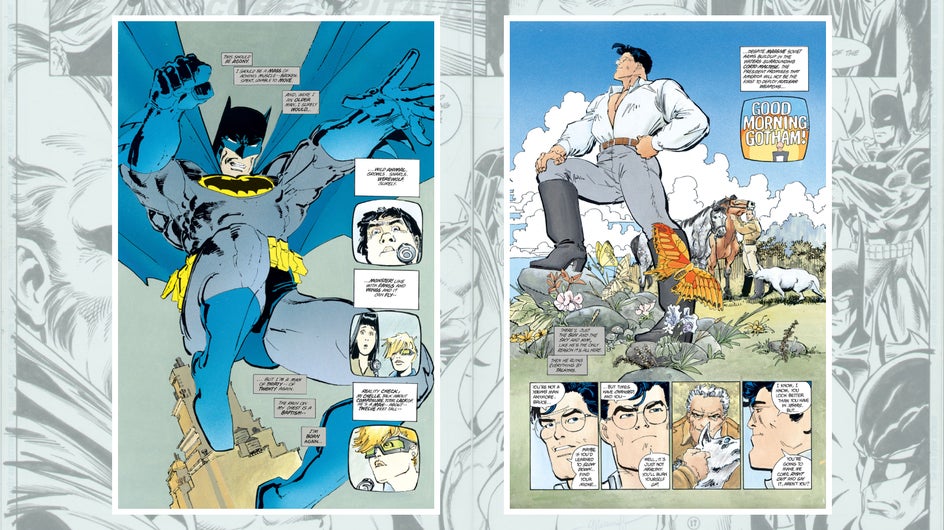
Comic book page layout is the invisible architecture that makes sequential storytelling work — and in 2026, understanding it has never been more valuable. Sales of comics and graphic novels in the U.S. and Canada totaled $2.2 billion in 2025, reaching an all-time high, with direct market sales up nearly 30% year over year (ICv2). Graphic novel sales surged another 28.5% in Q1 2026 alone (Comics Beat).
Behind every page driving that growth is a layout — a deliberate arrangement of panels, gutters, and visual flow that controls how readers experience a story. Whether you're designing a superhero splash page, a quiet dialogue scene, or a vertical-scroll webtoon episode, the layout is your storytelling engine.
Jenova's Comic Creator handles this entire process — from intelligent panel layouts and speech bubble integration to consistent character art across 200+ panels — so you can focus on the story, not the production pipeline.
This guide covers every principle of comic book page layout: panel types, gutter mechanics, page flow, print specifications, format differences, and how to apply them in practice.
Quick Answer: What Is Comic Book Page Layout?
Comic book page layout is the arrangement of panels, gutters, and visual elements on a page to control storytelling pacing, reading flow, and emotional impact.
- Panels contain individual moments or scenes — the building blocks of sequential narrative
- Gutters (the space between panels) control pacing and transition timing
- Page flow guides the reader's eye through panels in the intended reading order
- Panel variation (size, shape, borders) creates emphasis, drama, and rhythm
The Comic Creator on Jenova generates intelligent sequential layouts automatically, with six professional art style templates and speech bubble integration built into every page.
The Problem: Layout Is Where Most Comics Break Down
The comic market is booming — the global comic book market grew to USD 13.35 billion in 2026, projected to reach USD 19.6 billion by 2032 at a 6.5% CAGR (Research and Markets). But more creators entering the space means more pages that fail at the layout level.
Reading Flow Confusion
As pro comic artist Steve Ellis explains, the panel is "literally a wall that says to the reader 'here is a complete idea, read it and move onto the next.'" When layouts break reading flow, the entire storytelling collapses. A 2013 study by Neil Cohn at UC San Diego formally demonstrated that even comics-literate readers misread pages when panel arrangements violate expected flow patterns (Salgood Sam — Flow & the Eyelines).
The Consistency Grind
Maintaining consistent panel proportions, gutter widths, character scale, and lettering placement across dozens of pages is grueling manual work. As comics educator Palle Schmidt notes, "more than 6 or 9 panels per page is usually very hard on the eyes. And more than three speech balloons in one frame makes the story hard to follow" (Comics for Beginners).
Print-to-Digital Format Juggling
The standard US comic size of 6.625" × 10.25" is still the anchor for floppy interiors, but digital layouts need a different kind of planning. — Automateed, April 2026
Creators now need layouts that work in print and on screens — two fundamentally different reading experiences with different panel rhythms, safe zones, and pacing mechanics.
This is exactly what Comic Creator was built for — handling the technical complexity of layout so your creative energy goes into the story.
The Anatomy of a Comic Book Page
Understanding the building blocks of page layout is essential before designing your first panel. As comics scholar Chris Gavaler writes, "Layouts are the most distinctive and defining element of graphic narratives" (The Patron Saint of Superheroes).
📐 Panels
The panel is the fundamental unit of comic storytelling. Each panel contains a single moment, idea, or beat. Steve Ellis identifies several essential panel types (Clip Studio — Art Rocket):
| Panel Type | Purpose | When to Use |
|---|---|---|
| Close-up / Zoom-in | Highlight facial expressions or important objects | Emotional beats, reveals |
| Distant / Establishing shot | Show location, set the scene | Scene openings, transitions |
| Silhouette | Create drama, focus on key information | Tension, mystery, action climax |
| Overlapping panels | Show progression or simultaneous action | Fight sequences, montages |
| Diagonal / Irregular | Inject energy and disorientation | Action, chaos, psychological distress |
| Splash page | Full-page panel for pivotal moments | Major reveals, climactic scenes |
| Broken panel | Character or action extends beyond the border | Intense movement, power moments |
| Inset | Small panel placed over a larger panel | Detail emphasis, reaction shots |
📏 Gutters
The gutter — the space between panels — is what Gavaler calls "traditionally white space" that controls the transition between ideas. Ellis explains that gutters "control the pacing of your story":
- Standard-width gutters create smooth, even transitions
- Wide gutters give the reader more time to absorb — creating "in-between" moments
- No gutters (borderless) make actions feel simultaneous or immediate
- Overlapping panels create speed and urgency but risk confusing the reader
📖 Tiers
The Graphic Universe blog compares comic page elements to prose: "I like to think of a panel as a sentence. A horizontal row of panels is called a tier. I like to think of the tier as a paragraph" (Lerner Blog). Tier breaks signal changes in time, location, or narrative focus.
🔄 Page Flow
In Western comics, readers follow a Z-path: left to right across each tier, then down to the next. Manga reverses this to right-to-left. As Salgood Sam emphasizes, "Flow sums up a key concept in comics page or strip design: underlying structures that make the work legible, flow and should not need to be explained to readers" (Salgood Sam).
Key flow principles:
- Character eyelines should lead toward the next panel
- Leading lines in compositions direct the reader's gaze
- Speech balloons should read left-to-right within each panel — the first speaker always appears on the left
- Action direction should follow the reading flow (left-to-right in Western comics)
Why Comic Creator
Instead of manually ruling out grids, calculating safe zones, and wrestling with consistency across every page, the Comic Creator on Jenova handles the technical production while you direct the storytelling.
| Dimension | Manual Workflow | Comic Creator on Jenova |
|---|---|---|
| Panel layout | Rule out grids by hand or in software for every page | Intelligent sequential layouts generated from your script |
| Character consistency | Constant reference checking, proportion drift | Reference sheet architecture across 200+ panels |
| Speech bubbles | Manual placement, tail crossing risks | Integrated speech bubble placement with flow awareness |
| Art style | Years of practice per style | Six professional templates: Superhero, Noir, Indie, Franco-Belgian, Cartoon, Realistic |
| Story memory | Scattered notes, outlines, reference files | Persistent memory across sessions — characters, plot, world details carry forward |
"I'm writing a noir detective comic. Page 1 needs four panels: wide establishing shot of a rain-soaked alley, close-up of a hand pulling a photo from a puddle, medium shot of the protagonist examining it under a streetlight, and a reaction close-up showing recognition."
That single prompt produces a professionally laid-out page with consistent character art, appropriate noir styling, and speech bubble placement — no grid-ruling, no template hunting, no manual composition.
Common Page Layout Patterns
The Grid
The most fundamental layout. A regular grid (3×3, 2×3, 4×2) creates even pacing and a predictable reading rhythm.
Best known example: Watchmen uses a flexible 3×3 grid as its base pattern. As Gavaler notes, "Watchmen is the best known example of a flexible 3×3 regular base" — variations through combined and divided panels create visual interest while maintaining structural consistency (The Patron Saint of Superheroes).
When to use: Intimate conversations, methodical pacing, slice-of-life, literary narratives. Artist Seth has said a rigid grid "helps him as a reader to stop thinking about the frame and just engage in the content" (Salgood Sam).
The Flexible Grid
Most professional comics use a flexible grid — a base pattern (usually 3-row) with variations in panel size and count per tier. Steve Ditko's Amazing Spider-Man "fluctuates between rows of three and two panels" within a flexible 3-row base.
When to use: Action-adventure, superhero comics, most mainstream storytelling.
The Open Layout
No repeating base pattern. Panel sizes, shapes, and arrangements change freely from page to page.
When to use: Experimental narratives, dream sequences, high-energy action where visual chaos serves the story.
The Splash Page
A single image filling an entire page (or two-page spread). As Palle Schmidt explains, splash pages are "a panel that stretches across two a two-page spread" — used for maximum dramatic impact (Comics for Beginners).
When to use: Major reveals, climactic moments, establishing epic scale.
The Split Panel
One image divided into multiple panels, creating the illusion of time passing within a single composition. Schmidt calls this "an interesting idea for a layout" that gives "the illusion of time passing."
When to use: Slow-motion effects, contemplative sequences, parallel action.
Print Specifications for Comic Page Layout
Getting the layout right means nothing if the print specs are wrong. Here are the 2026 industry standards (Automateed; Linemark Printing):
| Specification | US Floppy | Trade Paperback | Manga | European Album |
|---|---|---|---|---|
| Trim size | 6.625" × 10.25" | 6" × 9" or 8.5" × 11" | ~5" × 7.5" | ~8.3" × 11.7" (A4) |
| Bleed | 0.125" per side | 0.125" per side | Varies | Varies |
| Safe zone | 0.25" inside trim | 0.25" inside trim | Tighter | More generous |
| Resolution | 300 DPI minimum | 300 DPI minimum | 300 DPI | 300 DPI |
| Color mode | CMYK | CMYK | B&W (typically) | CMYK |
| Drawing size | 11" × 17" (scale down) | 11" × 17" | Varies | Varies |
Critical rules:
- Keep all dialogue, faces, and essential art inside the safe zone (0.25" from trim edge)
- Extend backgrounds into the bleed area
- Saddle stitch (staple binding) works for 16–64 pages; perfect binding for graphic novels
- Gloss paper for vibrant superhero art; matte/silk for detailed, long-form reading
Featured Agents for Comic Creators
Comic Creator
Your personal comic book artist for crafting complete stories — from single issues to epic graphic novel sagas.
- Reference sheet architecture for character consistency across 200+ panels
- Six professional art style templates (Superhero, Noir, Indie, Franco-Belgian, Cartoon, Realistic)
- Intelligent sequential panel layouts with speech bubble integration
- Persistent story memory across sessions
Manga Creator
Specialized in Japanese manga storytelling conventions with right-to-left reading flow.
- Authentic manga panel flow and guttering
- Screen tone and inking style options
- Consistent character art across long-form serialized epics
Webtoon Creator
Mobile-first vertical scroll storytelling — a fundamentally different layout paradigm from page-based comics.
- Scroll rhythm mapping for optimal pacing
- Panel width variation for dramatic emphasis
- Platform-specific export presets (LINE Webtoon, Tapas, Lezhin)
Graphic Designer
For supporting visual assets — cover designs, promotional graphics, and brand identity for your comic series.
- Cover composition and typography
- Character design sheets and style guides
- Print-ready file preparation
Start with Comic Creator free — no credit card required.
How It Works: From Script to Finished Layout
Here's how to go from a story idea to professionally laid-out comic pages using the Comic Creator:
1. Define Your Format and Style
Tell the agent what format you're working in and what visual tradition you want:
"I'm creating a 24-page superhero comic for print at standard US trim size. I want a dynamic superhero style — bold lines, vibrant colors, lots of panel variation. Think Jim Lee meets Jorge Jiménez."
2. Establish Your Characters
Before any pages are laid out, build reference sheets for your main characters. The agent creates front, side, and three-quarter views with consistent proportions:
"My protagonist is a 28-year-old woman with an athletic build, dark curly hair past her shoulders, and a scar through her left eyebrow. Her costume is midnight blue with silver accents."
3. Script Your Pages with Layout Intent
Provide your script with as much or as little layout direction as you want. The agent adapts:
"Page 3: Open with a wide establishing shot of the city skyline at dusk — two tiers. Second tier: three panels — she lands on a rooftop, pulls back her hood, scans the street below. End the page on her expression as she spots something unexpected."
4. Generate, Review, and Refine
The agent produces the page following your script, maintaining character consistency and style coherence. Iterate on specific panels:
"Panel 2 needs a more dramatic angle — shoot from below to emphasize the height of the building. And widen the gutter before the last panel to create a pause."
5. Continue Across Sessions
Return days later. The agent remembers your characters, your story, your style preferences, and your layout patterns. Pick up exactly where you stopped — no re-explaining, no reference re-uploading.
Results & Use Cases
📚 Graphic Novel Production
Scenario: A writer has a 150-page graphic novel script and needs professional page layouts.
Traditional approach: Hire a layout artist and penciler ($100–$250/page), manage revisions over months, risk consistency drift across the project. Total: $15,000–$37,500.
Jenova approach: Use the Comic Creator to produce layouts chapter by chapter. Reference sheet architecture maintains character consistency across every page. Iterate on panel composition and pacing in real-time conversation.
🎌 Manga Page Design
Scenario: A creator wants to launch a serialized manga with authentic Japanese panel flow.
Traditional approach: Study manga layout conventions extensively, practice right-to-left composition, develop screen tone techniques — months of preparation before the first publishable page.
Jenova approach: The Manga Creator handles right-to-left reading flow, authentic guttering, and screen tone application. Persistent memory tracks character designs and plot threads across episodes.
📱 Webtoon Adaptation
Scenario: A print comic creator wants to adapt their work for vertical-scroll platforms.
Traditional approach: Manually reflow every page into scroll-friendly segments, adjust gutters and lettering scale, create new panel transitions — essentially redesigning the entire comic.
Jenova approach: The Webtoon Creator treats vertical scroll as a separate reading experience, not a resize. Scroll rhythm mapping, panel width variation, and platform-specific export presets handle the format translation.
🎓 Learning Layout Principles
Scenario: An art student wants to understand how different layout choices affect storytelling.
Traditional approach: Study reference books, analyze published comics, attempt to replicate layouts through practice.
Jenova approach: Ask the Comic Creator to render the same scene using a rigid 3×3 grid, a flexible grid with splash panel, and an open experimental layout. Compare the results to understand how structure shapes emotional impact.
2026 Layout Trends
Vertical Scroll Is Reshaping Panel Thinking
As Automateed notes, "Vertical scrolling is popular because it matches how people naturally consume content on phones." Creators are developing dual-format workflows — designing for print and scroll simultaneously, with different panel rhythms for each (Automateed).
Niche Genre Explosion Demands New Layouts
ICv2's Rob Salkowitz predicts that genres like LitRPG, Romantasy, and "Cozy" are crossing into comics, each bringing layout expectations from their source media. LitRPG comics may incorporate stat panels and UI-style overlays; Cozy comics favor gentle pacing with generous gutters (ICv2).
Short-Run Print Demands Professional Specs
With short-run digital printing now rivaling offset quality, indie creators need print-ready layouts from day one. Linemark Printing emphasizes that "the technical preparation of your files is what ensures that the final product matches your creative vision" — bleed, safe zones, and CMYK conversion are non-negotiable (Linemark).
Layout as Web Design Inspiration
Andy Clarke's influential Envato piece demonstrates how comic layout principles — panel size storytelling, gutter rhythm, border/bleed techniques — are being adopted by web designers. As Scott McCloud wrote in Understanding Comics, "a comic book's layout doesn't only contain the story, it becomes part of it" — a principle now applied to digital product design (Envato).
FAQ
What is the standard comic book page layout?
The most common layout is a flexible 3-row grid, where each row (tier) contains 1–3 panels of varying widths. The standard North American trim size is 6.625" × 10.25" for floppy comics, with a 0.125" bleed and 0.25" safe zone inside the trim. Most professional comics use 4–6 panels per page, though this varies by scene type — action pages use fewer, larger panels while dialogue pages tolerate more (Automateed; Clip Studio).
How many panels should a comic page have?
There's no fixed rule. Action pages often need 3–4 large panels so motion reads clearly. Dialogue pages can handle 5–7 panels because conversation carries the pacing. Reveal pages may use a single splash panel. As Automateed advises, "instead of chasing a panel count number, plan the page beat first, then build a panel layout that supports it" (Automateed).
Can I create professional comic layouts without drawing skills?
Yes. Jenova's Comic Creator converts scripts into sequential comic pages with intelligent panel layouts, consistent character art, and speech bubble integration — no drawing required. You provide the story and creative direction; the agent handles the visual production.
What's the difference between comic, manga, and webtoon layouts?
Western comics use left-to-right, page-based layouts (typically 6.625" × 10.25"). Manga uses right-to-left reading with tighter panel spacing on smaller pages (~5" × 7.5"). Webtoons use vertical scroll with no page breaks — panels flow downward with variable widths. Each format has distinct pacing conventions. Jenova offers specialized agents for each: Comic Creator, Manga Creator, and Webtoon Creator.
What are gutters in comic book layout?
Gutters are the spaces between panels. They control pacing — standard-width gutters create smooth transitions, wide gutters create pauses, and removing gutters makes actions feel simultaneous. As Steve Ellis explains, "the gutter's job is to be the space between ideas" — giving the reader time to absorb one panel before moving to the next (Clip Studio).
How big is the comic book market in 2026?
The global comic book market is valued at USD 13.35 billion in 2026, projected to reach USD 19.6 billion by 2032 at a 6.5% CAGR. In North America, comics and graphic novels hit $2.2 billion in 2025, with graphic novel sales surging 28.5% in Q1 2026 (Research and Markets; ICv2; Comics Beat).
Conclusion
Comic book page layout is where storytelling becomes visual architecture. Every panel size, gutter width, and flow decision shapes how your reader experiences the narrative — controlling pacing, emphasis, emotion, and comprehension. From the rigid 3×3 grid of Watchmen to the explosive open layouts of modern superhero comics to the vertical scroll rhythm of webtoons, layout is the craft that separates amateur pages from professional storytelling.
Whether you're designing your first comic or your fiftieth, the principles remain the same: guide the eye, control the pace, and let the layout serve the story.
Try Comic Creator now — go from script to professionally laid-out pages with consistent characters and intelligent panel design. Explore more creative agents at Jenova.