AI Brochure Maker: From Fold Selection to Finished Layout
2026-08-28
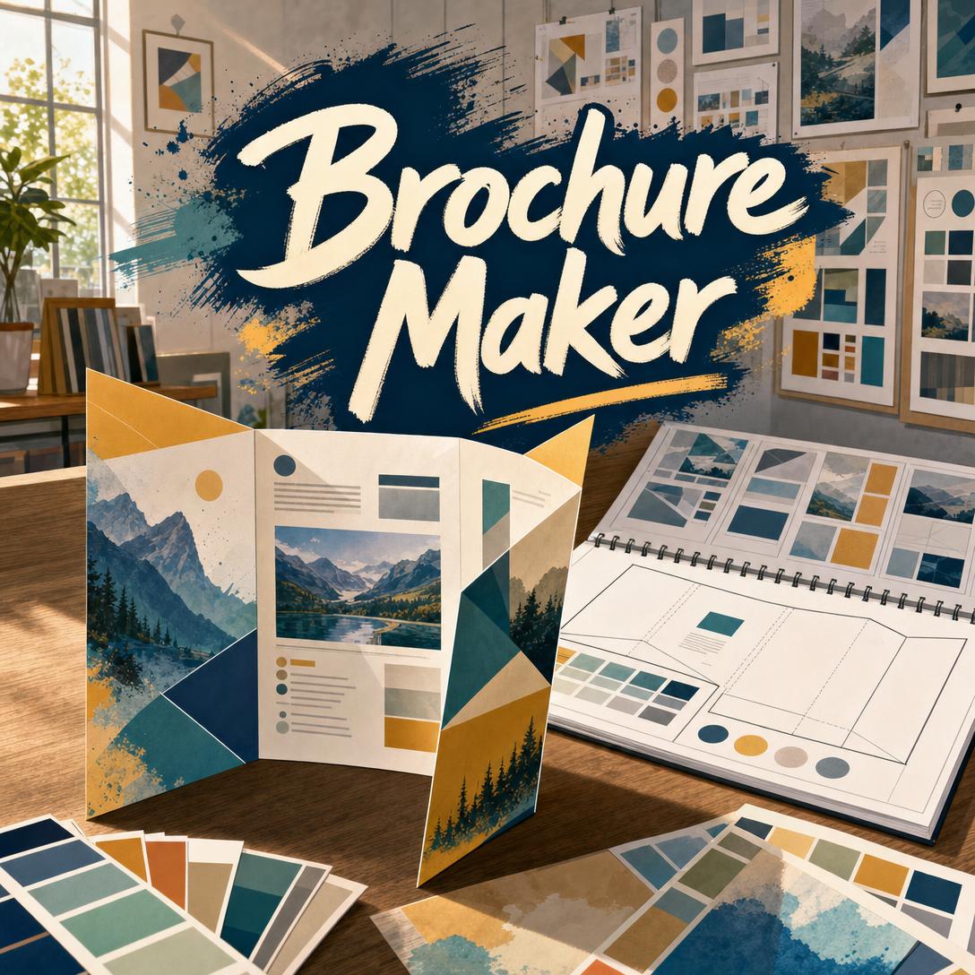
Brochure Maker helps you design professional multi-panel brochures by matching fold type, panel sequence, and visual direction to the story you need to tell. While most brochure templates treat six panels as six disconnected rectangles, this AI plans the reveal order first — then designs covers, interior spreads, and closing panels as one continuous piece.
- ✅ Fold-aware layouts for tri-fold, bi-fold, z-fold, and gate fold formats
- ✅ Panel-by-panel content planning that follows how a reader actually unfolds the piece
- ✅ Cross-panel color, typography, and imagery that hold together when opened
- ✅ Print-aware guidance on bleed, safe zones, paper stock, and finishing
A brochure is not a flattened poster. It is a guided journey with a hook, a middle, and a close. To understand why that distinction matters, it helps to look at what still makes print collateral worth designing — and where most brochure projects fall apart.
Quick Answer: What Is Brochure Maker?
Brochure Maker is an AI brochure designer that maps your content to fold types, plans each panel’s job, and generates cohesive outside and inside spreads from a single brief.
Key capabilities:
- Fold selection matched to content volume and narrative (tri-fold, bi-fold, z-fold, gate fold, and denser formats)
- Panel hierarchy: cover hook, interior persuasion, back-panel close
- Typography and color systems that stay consistent across every panel
- Brand-aware direction from uploaded logos, palettes, and reference photos
- Print production notes covering bleed, safe zones, stock, and finishes
Creative Challenges: Why Most Brochures Never Get Unfolded
Print still earns attention that screens struggle to hold. In RRD’s 2025 print marketing research, marketers treated physical mail as a brand moment — something held, not just clicked — and consumers still engage with what lands in their hands.
72% — Share of participants who regularly read or look at ads in the mail
Trust follows that tactile gap. An eMarketer finding summarized by ACS Media Group reported that 46% of U.S. adults trust print ads. Processing load is lower, too:
21% less cognitive effort — Direct mail versus digital media, according to Two Sides North America
The channel is not shrinking into irrelevance. The Business Research Company valued the global print advertising market at $53.35 billion in 2025** and **$55.26 billion in 2026, with a path toward $66.76 billion by 2030.
But picking up a brochure is frustratingly difficult to earn when the design itself works against the fold:
- Panel soup. Services, testimonials, pricing, and a map compete on the same interior panel. Readers scan, then stop.
- Fold-blind layout. Headlines sit on the crease. A hero photo splits at the hinge. The inside flap is treated as leftover space.
- Template sameness. A real-estate tri-fold looks like a dental tri-fold with different stock photos.
- Print surprises. Backgrounds stop short of the trim. Contact details drift into the danger zone. What looked sharp on screen arrives with white slivers and clipped type.
Adobe’s 2026 creative forecast points toward tactile, organic, and culturally specific design — the opposite of generic template grids. Vistaprint’s 2026 graphic design outlook describes a shift away from ultra-slick digital minimalism toward warmer, heritage-rooted work. Corporate pieces are moving the same way: sharper structure and stronger data storytelling, not more decoration.
That is the brief a brochure designer has to answer: a physical object people still trust, designed for how paper actually folds.
How Brochure Maker Plans a Piece Before It Draws One
Brochure Maker starts with information architecture, not decoration. You describe the job — sell a listing, welcome new patients, walk a donor through impact — and it proposes a fold, assigns each panel a role, then generates the outside spread and inside spread as matching halves of one system.
Step 1: Brief the Purpose, Audience, and Must-Have Content
Say what the brochure is for, who will pick it up, and the facts that cannot be omitted. A restaurant needs hours, a map, and three signature dishes. A clinic needs a services list, insurance notes, and a booking path. The more specific the brief, the tighter the panel plan.
"Tri-fold brochure for a lakeside inn. Guests are couples planning weekend getaways. Must include the lakefront suite, tasting-menu dinner, kayak rentals, address, and a QR code to book. Warm, editorial, photography-forward — not corporate."
Step 2: Lock the Fold Type to the Content Load
Fold type is a narrative decision. Light, image-led stories belong on a bi-fold. Three or four topics fit a tri-fold. Sequences and timelines prefer a z-fold. Premium reveals belong on a gate fold. Dense programs may need a roll fold or a short booklet instead of cramming type onto six panels.
| Content profile | Fold that fits | Why |
|---|---|---|
| 1–2 topics, image-heavy | Bi-fold | Book-like spread, generous panel width |
| 3–4 topics, moderate text | Tri-fold | Six panels, familiar reveal order |
| Steps, timelines, maps | Z-fold | Panel-by-panel sequence plus a panoramic option |
| Dramatic product or property reveal | Gate fold | Doors open onto a wide interior hero |
| 5+ topics, heavy copy | Roll fold or booklet | Extra panels without unreadable density |
If you already have a Brand Kit Generator system — palette, type pair, logo clear space — upload it here so the brochure inherits the same visual rules instead of inventing a second brand.
Step 3: Generate the Outside Spread, Then the Inside Spread
Default output is spread-based: one landscape image for the exterior panels (inside flap, back, front cover on a tri-fold), then a matching interior spread. Subtle fold indicators show where paper actually bends. Short headlines render most reliably; body copy is placed for hierarchy, with the expectation that final legal-accurate text can be overlaid in a layout tool when a press check demands it.
"Outside spread first. Front cover: ‘Weekends on the Water’ with a dock-at-dusk photo. Back panel: address, hours, phone, Instagram, QR. Inside flap: a three-line innkeeper note. Keep gold and deep teal continuous across the folds."
Step 4: Iterate One Layer at a Time
Change structure, type, color, or a single panel without throwing away the system. “Warm the palette” should not reset the fold. “Move testimonials to the center panel” should not redraw the cover. Ask for alternatives when the first direction is competent but not memorable.
"Keep the outside spread. On the inside, give the center panel to the tasting menu as the hero, shift kayaks to the left, and put the booking CTA on the right. Increase headline weight; body text stays readable."
Step 5: Translate the Layout into Print Reality
Spreads are high-quality layout references, not vendor-ready press files. Before you send anything to a printer, extend backgrounds through bleed and keep critical type away from trim and creases. Greenerprinter’s production guidance is the standard most shops still expect:
0.125" bleed, ~0.25" safe zone — Typical bleed and safety margins for print
Paper and finish change the read. Coated 100–130 gsm suits everyday marketing pieces; 170 gsm and up feels premium; uncoated stock supports text-heavy or eco-positioned brands. Gloss loves photography; matte reduces glare on body copy; soft-touch lamination signals luxury. Spot UV, foil, and emboss are worth specifying when a logo or headline needs a physical accent.
Try Brochure Maker free — no credit card required.
Creative Showcase: Brochures Built Around a Real Reveal
🏡 Open-House Listing That Survives the Kitchen Counter
Scenario: A listing agent needs a tri-fold for Sunday traffic — hero photo on the cover, room highlights inside, map and agent contacts on the back. Buyers will pocket it, not pinch-zoom a PDF in the driveway.
Traditional approach: A generic real-estate template, stock sky replacements, and contact details riding the fold. An hour in layout software, plus another round after the printer flags missing bleed.
Brochure Maker: Brief the property, the three selling points, and the showing time. The cover carries one image and one promise. Interior panels separate lifestyle, specs, and neighborhood. The back panel holds the QR, license details, and a single call-to-action.
- Fold-aware photo placement so the facade does not split at the hinge
- Specs set in a readable type hierarchy, not a wall of icons
- A matching leave-behind from Business Card Maker so the brochure and card share palette, type, and tone
🍽️ Restaurant Brochure You Can Brief from a Phone
Scenario: A chef-owner is between lunch and dinner service. They photograph the dining room, list three prix-fixe courses, and need a bi-fold that works as both table piece and takeaway. The entire brief happens on a phone between ticket times.
Traditional approach: A designer waits on copy, then another three days for a first proof. Or a free template that makes a tasting menu look like a coupon mailer.
With this brochure designer: Upload the room photo, paste the menu in any order, and specify “warm editorial, cream and terracotta, serif headlines, food-led.” The outside becomes name, hook, and hours. The inside spread becomes courses and a reservation CTA.
- Mobile-to-layout in one conversation — web, iOS, and Android share the same session
- Placeholder copy clearly flagged when the wine list is still unfinished
- Print notes for uncoated stock if the brand is farm-to-table rather than nightclub-glossy
Overnight Prints’ 2026 print-trend read puts photo-centered layouts, color layering, and collage thinking at the center of current work — exactly the register a hospitality piece should inhabit when the food is the hero.
🎟️ Festival Program That Does Not Fight the Accordion
Scenario: A three-day neighborhood festival needs a z-fold: Friday, Saturday, and Sunday as sequential panels, with a full-width map when the piece is opened flat. Volunteers will hand it out at the gate.
Traditional approach: A tri-fold stuffed with 40 event names in 8-point type. The map is an afterthought on the back. People use their phones instead.
The AI designer: Treats each exterior panel as a day, then uses the interior as a panoramic site map and legend. Headlines stay short. Stage times stay scannable. The back panel still closes with transit, weather, and a QR to the live schedule.
- Sequential reveal that matches how an accordion fold is actually opened
- Density control — if the lineup will not fit, the design says so instead of shrinking type into oblivion
- A companion street-team piece from Flyer Maker for poles and windows, using the same palette so the campaign reads as one system
🏥 Clinic Guide Patients Will Actually Keep
Scenario: A family practice needs a patient-information tri-fold: services, new-patient steps, insurance, and after-hours rules. The audience is parents in a waiting room, not a design jury.
Traditional approach: A Word document exported to PDF, printed on thin stock, with a clip-art caduceus and a wall of justified body copy.
Fold-aware design: Cover states the promise in plain language. The inside flap is a three-step “your first visit.” Interior panels separate pediatrics, adult care, and diagnostics. The back panel is phone, portal, and map — always visible when the brochure is folded.
- High-contrast body text sized for reading, not poster display
- Section color shifts instead of a new decorative header on every panel
- Honest production specs so the office manager can order 1,000 copies without a reprint
FAQ
Is Brochure Maker free?
Yes. You can design brochures on the free plan with core features and limited monthly usage. Paid tiers increase usage and unlock custom model selection, starting at $20/month for Plus. Usage resets on your billing date with no daily caps, so a launch-week burst of covers and interior spreads is available from day one. Start on free, then move up only if volume requires it.
What fold types can this AI brochure designer create?
Tri-fold (letter fold) is the default because it fits most marketing stories. Bi-fold suits shorter pieces such as menus, programs, and invitations. Z-fold handles sequences, timelines, and maps. Gate fold is for premium reveals — real estate panoramas, luxury product launches, gala programs. When copy exceeds those formats, the designer will recommend a roll fold or a short booklet rather than crushing type onto six panels.
How is Brochure Maker different from a template library?
Templates freeze panel widths and usually ignore reveal order. Brochure Maker chooses a fold from your content, assigns each panel a job, and keeps color, type, and motifs continuous across both spreads. You can upload brand assets, drop in real photography, and iterate on one panel without regenerating the rest. The result is a directed piece, not a recolored three-column grid.
Does Brochure Maker work on mobile?
Yes. Sessions work across web, iOS, and Android with synced history, so a site visit, a kitchen-pass photo, or a trade-show aisle can become a cover brief on the phone you already have. Speech-to-text is available when your hands are full. Follow-up edits — “swap the hero image,” “move the map to the back panel” — land in the same thread.
Are the brochures print-ready?
The spreads are screen-resolution layout references: composition, hierarchy, palette, and copy placement. For press, export the direction into InDesign, Affinity Publisher, or Canva and apply your printer’s bleed, fonts, and color profile. Standard starting points are 3 mm / 0.125" bleed and a safe zone of about 0.25" from trim and folds, confirmed with the shop. That split keeps design speed high without pretending a generated image is a press PDF.
Can it follow my brand and design for different cultures?
Upload logos, palettes, and guidelines and the layout locks to those rules. Audience context also shapes the visual language — refined whitespace, calligraphic hierarchy, geometric pattern, or warm saturated color — including right-to-left panel order for RTL scripts. If you need a broader identity system before the first brochure, generate the palette and type pairing first, then bring those decisions into the brochure brief.
Design the Brochure Someone Will Keep
Print still earns a second look because it occupies a hand, not a tab. The market around it is growing, trust scores remain higher than many digital formats, and 2026 design culture is rewarding work that feels physical, local, and intentionally made. What fails is not the medium. It is the brochure that was never planned as a sequence.
Brochure Maker treats fold type, panel roles, and visual continuity as the design — then generates outside and inside spreads you can iterate until the cover hooks and the back panel closes. Brief the audience, confirm the fold, and put the next piece in someone’s hands.
Try Brochure Maker now. Explore more at Jenova.
For Developers: Brochure Maker is available programmatically via the Jenova API — integrate fold-aware brochure design into your application with a single API call. Full documentation →